Table of Contents
Why CMYK Is Not Enough in Umbrella Printing
What 10+ years in umbrella manufacturing has taught me about color matching on fabric.
What to do if you want accurate umbrella colors
- Use CMYK/RGB as a reference, not a promise. Fabric behaves differently from paper and screens.
- Approve with a physical fabric sample. Compare against Pantone (if applicable) and reprint until it matches.
- Check under daylight. Indoor lights can make “correct” colors look wrong outdoors.
- Flag special colors early. Fluorescent tones and corporate blues need extra attention.
Contents
1) The CMYK/RGB misunderstanding
2) Screen color vs. fabric color
3) Why physical sampling is non-negotiable
4) Fluorescent colors: the hard truth
5) Why blue is the hardest color
6) Lighting: the hidden variable
7) The hidden cost of skipping color control
8) Final advice from the production floor
FAQ
1) The CMYK/RGB misunderstanding
Over the years, I’ve worked with hundreds of buyers, brand managers, and designers on custom umbrella projects.
Because of that, I keep hearing the same question:
“We’ve already provided the CMYK or RGB values. Why doesn’t the printed umbrella match the design exactly?”
It’s a fair question. However, here’s the honest answer:
CMYK and RGB are only the starting point — not the final result.
In other words, digital color codes alone are not enough to guarantee accurate color on fabric.
So, let’s break down why this happens and how to avoid surprises.
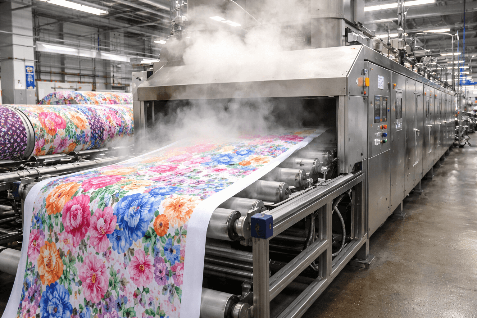
2) Screen color vs. fabric color: they’re not the same world
First, when you see a color on a screen, you’re seeing RGB (light-based color).
Meanwhile, umbrellas are produced with ink-based systems.
That sounds straightforward, but fabric changes everything.
Umbrella canopies are typically made from polyester or pongee.
Compared to paper, these materials behave differently.
For example, they can:
- absorb ink at different rates
- reflect light differently
- include waterproof or UV coatings
- react to humidity and temperature
As a result, the same CMYK values that look perfect on coated paper can look different on umbrella fabric.
Sometimes the deviation is small. Yet, sometimes it’s big enough to cause real trouble—especially at scale.
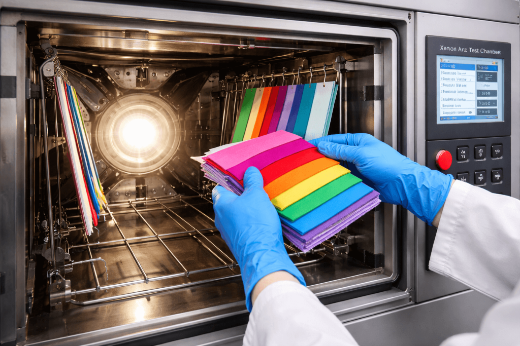
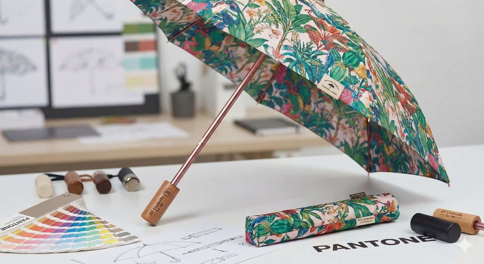
3) Why physical sampling is non-negotiable
Because fabric introduces variables, we never approve color based only on digital files.
Instead, we follow a real-world process that reduces risk.
- Print a physical fabric sample
- Compare it against a Pantone reference (if provided)
- Evaluate under natural daylight
- Adjust the ink profile/formula
- Repeat until visual alignment is achieved
Screens lie. Fabric doesn’t. Therefore, a physical sample is the fastest way to reach a reliable decision.
4) Fluorescent colors: the hard truth most designers don’t hear early enough
Many designers are surprised by this:
true fluorescent colors usually cannot be reproduced accurately by standard digital printing or heat transfer.
Here’s why. True fluorescent color requires special pigment-based inks that reflect UV light.
By contrast, most digital methods rely on CMYK process inks.
So, while digital printing can simulate “bright,” it cannot create that real fluorescent glow.
For example, neon yellow or neon pink might look electric on screen.
However, if you print it with CMYK processes, it often looks flat.
Therefore, if fluorescent impact is critical, screen printing with fluorescent pigments is usually the correct path.
5) Why blue is the hardest color to control
If you ask experienced printers which color causes the most headaches, you’ll hear one answer again and again:
blue.
Blue tones are extremely sensitive to small changes, including:
- fabric texture
- ink thickness
- lighting conditions
- tiny pigment ratio shifts
Consequently, a tiny variation can push blue toward purple or toward green.
Even worse, it can look correct under factory lights but different under daylight.
That’s why corporate blues (navy, royal blue, etc.) usually need extra rounds of sampling.
6) Lighting: the hidden variable that breaks “perfect” matches
Pantone matching must be judged properly.
However, factory fluorescent lighting is not equal to daylight, and indoor LEDs are different again.
Since umbrellas are used outdoors, we evaluate color under natural daylight whenever possible.
That way, what you approve is closer to what your customers will see on the street.
7) The hidden cost of skipping this process
When color control is ignored, the consequences are predictable.
For example, you may face:
- brand inconsistency
- customer complaints
- delayed campaigns
- reproduction costs
- unsellable inventory
In bulk production, even a small deviation multiplied across thousands of units becomes a major issue.
Therefore, professional manufacturing is not about printing fast—it’s about printing correctly.
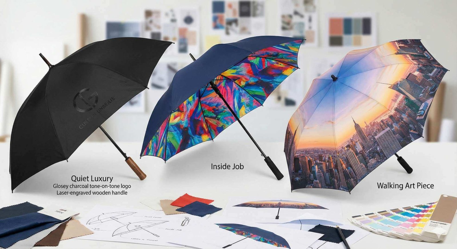
8) Final advice from experience
If you’re planning a custom umbrella project, here’s my honest advice:
- Treat CMYK values as a reference — not a guarantee.
- Be cautious with fluorescent colors if you’re using digital methods.
- Pay extra attention to blues because they shift easily.
- Always request a physical sample before bulk production.
- Confirm under proper lighting, ideally daylight.
At HFUmbrella, we’ve been manufacturing custom umbrellas for over 30 years.
From my own experience on the production floor, the biggest difference between average suppliers and professional manufacturers is simple:
attention to color detail.
If you’d like guidance on color matching for umbrella printing, feel free to reach out.
I’m always happy to share practical insights.
— Justin
Umbrella Printing Specialist
HFUmbrella
Need help matching your brand color on fabric?
Send your artwork (.AI/.PDF) and your target color (Pantone if available). We’ll advise the best method and sampling plan.
FAQ
Why doesn’t CMYK/RGB match the printed umbrella color?
Because umbrellas are printed on fabric, not paper. Fabric weave, coatings, ink absorption, humidity/temperature, and lighting can all change how the same CMYK/RGB values appear. So, CMYK/RGB are a reference—not a guarantee.
What’s the safest way to approve umbrella colors before bulk production?
Approve with a physical fabric sample. Compare it with a Pantone reference and check under daylight. If needed, adjust and reprint until the match is confirmed, then proceed to mass production.
Can digital printing or heat transfer produce true fluorescent colors?
Typically, no. True fluorescent effects require special pigment-based inks that reflect UV light. Standard CMYK digital processes can simulate brightness, but they usually can’t reproduce real fluorescent glow. Screen printing with fluorescent pigments is often required.
Why is blue so difficult to control on umbrella fabric?
Blue is very sensitive to small changes in ink ratio, fabric texture, ink thickness, and lighting. A tiny shift can push blue toward purple or green, and it can look different under daylight. That’s why blue often needs extra sampling rounds.
Which lighting should be used for Pantone matching on umbrellas?
Daylight is the most practical reference because umbrellas are used outdoors. Factory fluorescent and indoor LEDs can distort perception, so daylight checks reduce surprises.
What happens if a brand skips physical color confirmation?
You risk brand inconsistency, customer complaints, delayed campaigns, re-production costs, and unsellable inventory. In bulk orders, small deviations multiply into big losses.