Let’s be honest — nobody gets excited about an umbrella. Not at first. But here’s the thing: when the weather turns or the sun’s baking down and you hand someone a branded umbrella that actually looks good and does the job? That’s when it becomes something more. Useful, visible, memorable. And at a corporate event, where you’re surrounded by logos, freebies, banners and noise — being memorable is what counts.
So, if you’re thinking about umbrellas for your next event, don’t just chuck your logo on a black canopy and hope for the best. There’s more to it than that. Here’s how to make them work.
Table of Contents
Think About Context First
Before you even open your design file, think about where these umbrellas are going to show up. Are they being used at an outdoor conference? A networking event? An exhibition where people will be walking between halls?
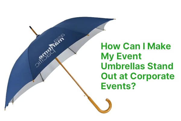
If they’re going to be opened and carried around during the event, you want visibility. Something people will spot across a crowd. That means bold colours, smart placement of branding, and ideally, repetition. If your logo’s on just one panel, it’ll be hidden half the time. But if it’s on two, or four, or alternates across the canopy — now it’s working.
If the umbrellas are a gift — something people will take away — the design can afford to be more subtle. You can go classy, muted, maybe even monogram-style. Different job, different approach.
![]()
Brand Visibility: Do More Than Just Stick a Logo On
A decent umbrella has eight panels. You’ve got options. Use them.
For events, it’s usually a good move to print on more than one side — especially if you’re hoping your branding will show up in photos or social content. And don’t forget, people see umbrellas from different angles: above, beside, even underneath. Think about where your messaging will be most effective.
Taglines can work well, as long as they’re legible. Short and bold is better than long and fiddly. You might even want to include a QR code if you’re pushing a campaign or collecting leads — we’ve seen brands do this on the inner panels so users see it when they open the brolly.
All of this should tie into your wider branding. Don’t go off-piste unless it’s deliberate. Make sure fonts, colour tones and messaging match the campaign or event you’re tied into.
Placement: Where Your Logo Actually Works
Big doesn’t always mean better. A centred logo on every panel might be loud, but not necessarily effective. Depends on the look you’re going for.
Some of the smartest branded umbrellas we’ve seen didn’t scream “look at me” — they nudged it. A well-placed logo on the edge, a pop of contrast colour around the trim, even branding on the handle or the strap can say a lot without dominating the whole thing.
For events with drone footage or press photos, logo placement on the top of the canopy makes sense — it’s what people will see from above. For user-facing branding, especially if these are being handed out and used on-site, the edges or interior panels are great real estate. It feels like you’ve thought about the experience, not just the design.
![]()
Get Colour Working For You
People underestimate colour. Or worse, they play it safe.
Yes, your brand might have a primary colour. But have you tested it on fabric? Under grey skies? With wet hands and a crowd around?
Some colours vanish. Some blend in with the pavement. And some — the right ones — stand out in all the right ways.
Bright colours, high contrast combinations, and even patterned designs can bring the whole thing to life. And if you’re running a limited-time campaign or activation, consider doing a special colour run — something that turns the umbrella itself into a collector’s item.
For example, we’ve worked with brands who kept their logo white, but played with neon yellow, forest green, or even deep burgundy canopies depending on the mood they were aiming for. The results didn’t just stand out — they got shared.
Details Make the Difference
It’s not just about the panels. Think about the finishing touches.
A matching sleeve with subtle branding? Nice touch. A wooden handle for a traditional feel, or rubberised grip for outdoor use? Makes a difference. Little things — like custom pull cords, metal tips, stitched edge detail — these are what elevate your umbrella from functional to brand-worthy.
And don’t forget how it’s presented. For giveaways, packaging matters. A simple branded tag or slipcase can take something that looks mass-produced and turn it into something people actually keep — and use.
![]()
A Few Real-World Wins
We’ve seen all kinds of clever umbrella executions. One of our clients, a large logistics company, designed a dual-colour umbrella with a pattern printed on the inside and a clean exterior — it matched their uniforms, signage, and even their event stands. The whole setup looked tied together, even in the rain.
Another, a drinks company running a private garden event, went sleek and understated: all black with a tone-on-tone monogram and matte finish. It looked like something from a high-end department store — and people actually asked where they could get one.
Then there was a tech startup that used the underside of the umbrella to feature a huge QR code linked to a discount offer. It was a bit cheeky, but it got people scanning — and buying. That umbrella drove more conversions than any of their printed leaflets.
Pulling It Together
So — how do you make your umbrellas stand out?
You think about who’s using them, and where. You treat the design like a serious piece of brand work, not just a last-minute add-on. You take risks when it makes sense. You aim for quality, not quantity. And you remember that good design gets remembered — but great design gets used.
At HF Umbrella, we’re not just printing logos. We’re helping you show up, stand out, and leave an impression — long after the event ends.
Want help designing an umbrella that’s actually worth carrying? Let’s talk. We’ll walk you through the right materials, shapes, styles, and print methods — and make sure what you hand out is something people will want to hold onto.
Get in touch for a free design consultation.